


Sandhya Garg — Colour & Craft
How to Choose Your Shade
Blue · Purple · Green · Pink · Red — Which Version of Each Is Yours
Quick Answer
Almost nobody suits or doesn't suit a colour — they suit particular shades of it. Cobalt, navy, teal and powder blue behave completely differently next to skin, and that's true of every colour on this page. The quickest useful filter is undertone: if your veins read blue or purple and silver jewellery looks better on you, you lean cool; if they read green or olive and gold looks better, you lean warm. Cool undertones tend to glow in blue-based shades — berry pink, true red, emerald, cobalt. Warm undertones tend to glow in yellow-based ones — coral, tomato red, olive, turquoise. That's a starting point, not a rule, and the rest of this guide is about when to follow it and when to happily ignore it.
“I can't wear pink” is one of the most common things I hear, and it's almost never true. What's usually true is that a specific pink — often a cool baby pink under bad lighting in a fitting room — didn't work, and the whole colour got written off on the evidence of one shade.
As a Project Runway designer who builds every print here from scratch, I spend a genuinely absurd amount of time on colourways — the same artwork on a warm ground versus a cool one is effectively two different dresses. This guide is the short version of what I've learned doing that.
In This Guide
Find Your Undertone in 60 Seconds
Undertone is not the same as how light or deep your skin is — it's the temperature underneath, and it stays constant whether you're pale or deep, tanned or not. Three quick checks, done in daylight rather than under a bathroom bulb:
1. The wrist test
Look at the veins on your inner wrist in natural light. Blue or purple suggests cool. Green or olive suggests warm. If you genuinely can't tell, that's a real answer too — you're likely neutral.
2. The jewellery test
Hold gold against your skin, then silver. Whichever makes your skin look brighter rather than the metal look brighter is your answer — gold for warm, silver for cool, both fine for neutral.
3. The white test
Hold a pure white next to a cream or ivory. Pure white flattering means cool; cream flattering means warm. This one is the most reliable of the three if you only do one.
Worth saying plainly: this framework works across every complexion, warm or cool, light through deep — it reads the relationship between your features rather than any single one. If you've been mistyped before by a method that assumed a narrow range of skin tones, that's a flaw in the method, not in you.
“When you give yourself more boundaries, you actually have more flexibility.”
— A stylist on colour analysis, speaking to Vogue Business
Every Colour, Shade by Shade
This is the part that actually matters. Not “does blue suit me” but which blue.
Blue
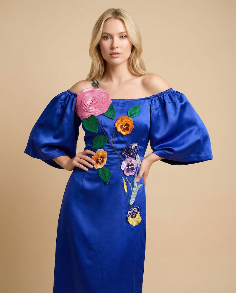
If you lean cool: royal blue, cobalt, navy, and icy powder blue. These are blue at its most blue — no yellow in them — and they make cool skin look clear rather than washed.
If you lean warm: turquoise, teal, aqua, and periwinkle. The green in them is doing the work — it warms the blue up enough to sit comfortably against golden skin.
Everyone: navy. It behaves almost like a neutral and is one of the genuinely safest colours in occasion wear. Shop blue dresses →
Purple
If you lean cool: true violet, amethyst, lavender and lilac. Purple is naturally cool-leaning, which is why it's often the easiest win for cool undertones and the trickiest colour for warm ones.
If you lean warm: plum, aubergine, and any purple with red or brown pulled into it. Skip icy lavender close to the face — it's the shade most likely to drain warm skin — but wear it happily as a skirt or a lower-half print.
Everyone: deep plum. Shop purple dresses →
Green
If you lean cool: emerald, jade, and pine. Blue-based greens — emerald in particular is one of the most reliably flattering colours in existence on cool skin.
If you lean warm: olive, sage, moss and chartreuse. Yellow-based greens read as earthy rather than jewel-toned and sit beautifully against golden skin.
Everyone: a mid sage. It's the most forgiving green there is. Shop green dresses →
Pink
If you lean cool: fuchsia, magenta, berry, and cool baby pink. The blue in them is what makes cool skin look lit rather than flushed.
If you lean warm: coral, peach, salmon, and warm blush. This is the group most people mean when they say “pink doesn't suit me” — they've only ever tried the cool ones.
Everyone: a mid rose that sits between the two. Shop pink dresses →
Red
If you lean cool: true red, cherry, crimson and burgundy — anything with blue underneath it.
If you lean warm: tomato, brick, rust and scarlet — reds with orange in them.
Everyone: a true red sitting exactly between blue and orange is the closest thing to a universal red. Shop red dresses →
When to Ignore All of This
I want to be straight about the limits of what you just read, because colour-analysis content online has a habit of hardening into rules that make people feel narrower rather than freer.
Undertone guidance answers one specific question: how does this shade read optically next to your skin? That's genuinely useful, and it's why the same dress can look sharp on one person and tired on another. But it is a completely different question from how does this colour make you feel? — and the research on that second question points somewhere else entirely. As covered in our post on dopamine dressing, the peer-reviewed work on enclothed cognition found that the meaning you personally attach to a garment is what shifts your mindset — not the pigment itself.
So both things are true at once, and they don't conflict. Undertone tells you which version of a colour will flatter. Personal association tells you which colour will lift you. When those two point at the same shade, buy it immediately. When they disagree — when the “wrong” yellow is the one that makes you feel like yourself — wear the yellow. Nobody at the party is running a wrist test.
Three Practical Workarounds
Love a shade that isn't in your column? Move it away from your face — as a skirt, a lower-half print, or a wide hem. Break it with a layer — a jacket in your best shade next to the skin, the beloved colour underneath. Or find it in a print, where it sits among other shades rather than flat against your complexion. A multi-colour print is the single easiest way to wear anything.
Choosing Colour by Occasion
Undertone tells you which shade. The occasion often tells you which colour family to reach for in the first place.
| Occasion | Reach for |
|---|---|
| Daytime wedding or garden party | Soft or saturated brights — never white or cream |
| Evening reception or cocktail event | Jewel tones, deep plum, navy, emerald, black |
| Resort, beach or holiday | Turquoise, coral, marigold — colour that holds up in strong sun |
| Baby or bridal shower as a guest | Mid-tone pinks, greens and blues; nothing that upstages |
| Work event or something you want taken seriously | Navy is the most quietly authoritative colour there is |
| Autumn and winter | Depth over brightness — burgundy, forest, aubergine, teal |
| Photographs matter more than usual | Saturated over pastel; pale shades wash out on camera |
Ten Picks · Two Per Colour · XS to 3XL
One Warm, One Cool, Per Colour
Every print designed in-house, so the colourways are chosen rather than inherited — which is the whole reason this guide is possible.
Blue

Purple


Green


Pink


Red


All pieces XS · S · M · L · XL · XXL · XXXL (select styles) · Custom sizing available · Free US shipping over $250
Frequently Asked Questions
How do I know if I have warm or cool undertones?
Three quick checks in natural daylight. Veins on the inner wrist reading blue or purple suggests cool; green or olive suggests warm. Silver jewellery flattering suggests cool, gold suggests warm. And pure white flattering suggests cool, while cream suggests warm. If two of the three agree, that's your answer. If none do, you're likely neutral — which means most shades will work.
Which shade of blue suits me?
Cool undertones tend to suit royal blue, cobalt and navy — blues with no yellow in them. Warm undertones tend to suit turquoise, teal and aqua, where green softens the blue. Navy works on almost everyone and behaves like a neutral in occasion wear.
What if my favourite colour isn't in my palette?
Wear it anyway, and use one of three workarounds: move it away from your face as a skirt or lower-half print, layer a more flattering shade closest to your skin, or find the colour inside a multi-colour print where it sits among other shades. Colour that makes you feel like yourself has value that no undertone chart accounts for.
Does skin tone matter as much as undertone?
Undertone matters more for choosing a shade's temperature; depth of skin tone matters more for choosing intensity. Deeper complexions generally carry highly saturated and bright colours beautifully, while very soft pastels can read faint. The framework applies across every complexion — it reads how your features relate to each other, not any one feature alone.
What colour dress photographs best?
Saturated colour over pastel, almost always. Pale shades lose definition on camera and can wash out against skin under flash. Jewel tones, true reds and cobalt all photograph exceptionally well, which is worth weighing for weddings and events where photographs matter.
Is seasonal colour analysis actually accurate?
It's a useful filtering framework rather than a science. The system was popularised by Carole Jackson's Color Me Beautiful and draws on much older colour research, and it genuinely helps narrow choices. Treat it as a way to stop guessing, not as a set of rules about what you're allowed to wear.
Keep Reading
The Other Half
Dopamine Dressing
How colour makes you feel, versus how it reads.
Behind It
How Our Prints Are Made
Why every colourway here is a deliberate choice.
Colour & Travel
Cities Known for Their Colour
Where these palettes originally came from.
By Occasion
All Wedding Dress Codes Explained
Including which colours are off-limits.
About the Writer
Sandhya Garg is a Project Runway Season 13 designer who won two challenges on the show and presented her collection at Mercedes-Benz New York Fashion Week. She studied womenswear at London College of Fashion and worked at Alexander McQueen, Gucci, Liberty London, and Alice Temperley. Her Los Angeles label creates limited-edition artisanal dresses in original prints — every colourway developed in-house — in sizes XS–3XL with custom sizing available.
Project Runway · Vogue · Marie Claire · XS–3XL
There's a version of every colour for you.
Sandhya Garg is a Los Angeles boutique creating limited-edition artisanal dresses in original prints and considered colourways. Sizes XS–3XL, custom sizing available.





Leave a comment